
Mobile-First Design: Why Google Judges Your Site on Mobile First
Mobile first design has become one of the most important principles of modern website development. Today, most users browse the internet on smartphones, and Google now evaluates websites primarily based on their mobile version rather than the desktop version. This means your website’s mobile experience directly influences search rankings, user engagement, and conversion rates.
A website that looks great on a desktop but performs poorly on mobile devices can lose visibility in search results and drive potential customers away. Slow loading times, difficult navigation, and poor responsiveness all contribute to a negative user experience that affects both SEO and business growth.
At Advait Technology Labs, we design and develop fast, SEO-friendly, and mobile-optimized websites that help businesses improve search visibility, enhance user experience, and increase conversions. In this guide, we’ll explain what mobile-first design is, why Google prioritizes it, and how businesses can build websites that perform exceptionally across every device.
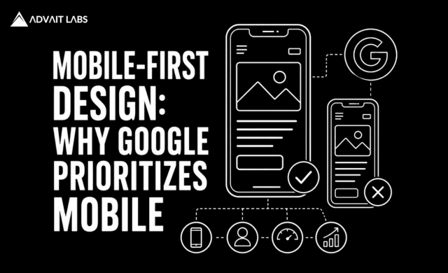
What Is Mobile First Design?
Mobile first design is a web design approach where websites are designed for smartphones and smaller screens before being adapted for tablets and desktop devices.
Instead of shrinking a desktop website to fit mobile screens, mobile-first design begins with the mobile experience and gradually adds enhancements for larger devices.
This approach ensures users receive a fast, intuitive, and consistent experience regardless of the device they use.
What Is Mobile-First Indexing?
Many people confuse mobile-first design with mobile-first indexing.
Although closely related, they are different concepts.
Mobile-first indexing means Google primarily uses the mobile version of your website for crawling, indexing, and ranking.
If your mobile website provides incomplete content or poor usability, Google evaluates your website based on those shortcomings—even if your desktop version performs well.
This is why mobile-first design has become essential for SEO.
Why Does Google Prioritize Mobile Websites?
Google introduced mobile-first indexing because mobile devices now account for the majority of internet traffic worldwide.
Users expect websites to:
- Load quickly
- Display correctly on every screen size
- Be easy to navigate
- Provide clear content
- Offer smooth interactions
Google’s goal is to deliver search results that provide the best possible experience for mobile users.
As a result, websites with strong mobile performance are better positioned to compete in search rankings.
Why Mobile-First Design Matters for SEO
A well-executed mobile-first design contributes to several important SEO factors.
Better Search Rankings
Since Google primarily evaluates the mobile version of a website, strong mobile usability supports better visibility in search results.
Improved User Experience
Visitors stay longer when websites are easy to use.
Simple navigation, readable text, responsive layouts, and fast loading speeds improve overall engagement.
Lower Bounce Rates
Users quickly leave websites that are difficult to navigate on smartphones.
A mobile-first approach reduces frustration and encourages visitors to explore more pages.
Higher Conversion Rates
Whether users want to contact your business, request a quote, or make a purchase, a seamless mobile experience removes barriers that prevent conversions.
Better Core Web Vitals Performance
Mobile-friendly websites often perform better across Google’s Core Web Vitals metrics, which measure page loading speed, responsiveness, and visual stability.
Key Principles of Mobile First Design
Building a mobile-first website involves much more than responsive layouts.
Responsive Design
Your website should automatically adjust to different screen sizes without compromising usability.
Responsive design ensures consistency across smartphones, tablets, laptops, and desktops.
Fast Loading Speed
Mobile users expect websites to load within seconds.
Improve speed by:
- Compressing images
- Optimizing code
- Using browser caching
- Minimizing unnecessary scripts
- Choosing reliable hosting
Faster websites improve both SEO and user satisfaction.
Simple Navigation
Navigation should remain intuitive on smaller screens.
Use:
- Clear menus
- Logical page hierarchy
- Easy-to-tap buttons
- Visible calls to action
Complicated navigation often leads to higher bounce rates.
Readable Content
Content should be easy to read without zooming.
Maintain:
- Appropriate font sizes
- Clear spacing
- Short paragraphs
- Well-structured headings
Readable content improves both accessibility and engagement.
Touch-Friendly Interface
Buttons, forms, and links should be large enough for comfortable interaction.
Avoid placing clickable elements too close together.
How Mobile First Design Supports Business Growth
A mobile-friendly website doesn’t only benefit SEO—it also improves business performance.
Businesses with optimized mobile experiences often achieve:
- Higher engagement
- Better lead generation
- Increased online sales
- Improved customer trust
- Stronger brand perception
Customers are more likely to interact with businesses that provide smooth digital experiences.
Mobile First Design and AI-Powered Search
Search is rapidly evolving through AI-powered experiences such as Google AI Overviews, ChatGPT Search, Gemini, and Perplexity.
These systems prioritize websites that demonstrate:
- High-quality content
- Fast performance
- Strong technical SEO
- Excellent user experience
Mobile first design supports these objectives by creating accessible, well-structured websites that AI systems can efficiently crawl and understand.
As AI-driven search continues to grow, mobile optimization becomes even more valuable.
Mobile First Design Best Practices
Businesses should regularly evaluate their websites using the following best practices:
- Design for mobile screens first.
- Use responsive layouts across all devices.
- Optimize page speed and Core Web Vitals.
- Compress images without sacrificing quality.
- Simplify navigation and menus.
- Make buttons easy to tap.
- Maintain readable typography.
- Test across multiple mobile devices.
- Monitor performance using Google Search Console and PageSpeed Insights.
These practices improve both search performance and customer satisfaction.
Final Thoughts
Mobile first design is no longer optional. It has become the standard for creating websites that perform well in search results and deliver exceptional user experiences.
Because Google primarily evaluates the mobile version of your website, businesses that ignore mobile optimization risk losing rankings, traffic, and potential customers.
By focusing on responsive design, fast loading speeds, intuitive navigation, and strong technical SEO, businesses can create websites that support long-term growth across both traditional search engines and AI-powered search platforms.
If you’re planning a new website or upgrading an existing one, Advait Technology Labs can help you build a modern, SEO-friendly, mobile-first website that drives measurable business results.
Frequently Asked Questions
What is mobile first design?
Mobile-first design is a web design approach that starts with designing for smartphones before adapting the website for larger screens like tablets and desktops.
Why is mobile first design important for SEO?
Google primarily indexes and ranks websites based on their mobile version, making mobile optimization a key ranking factor.
Is mobile first design the same as responsive design?
No. Mobile-first design is a design strategy, while responsive design is the technical implementation that allows layouts to adapt across different screen sizes.
How can I check if my website is mobile-friendly?
You can review your website’s mobile usability, Core Web Vitals, and performance using tools such as Google Search Console and Google PageSpeed Insights.